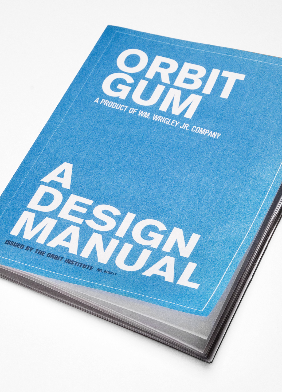
Orbit Gum Styleguide
Client: Wm. Wrigley Jr. Company
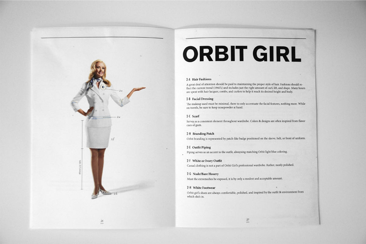
Role: Art Director, Designer, Illustrator
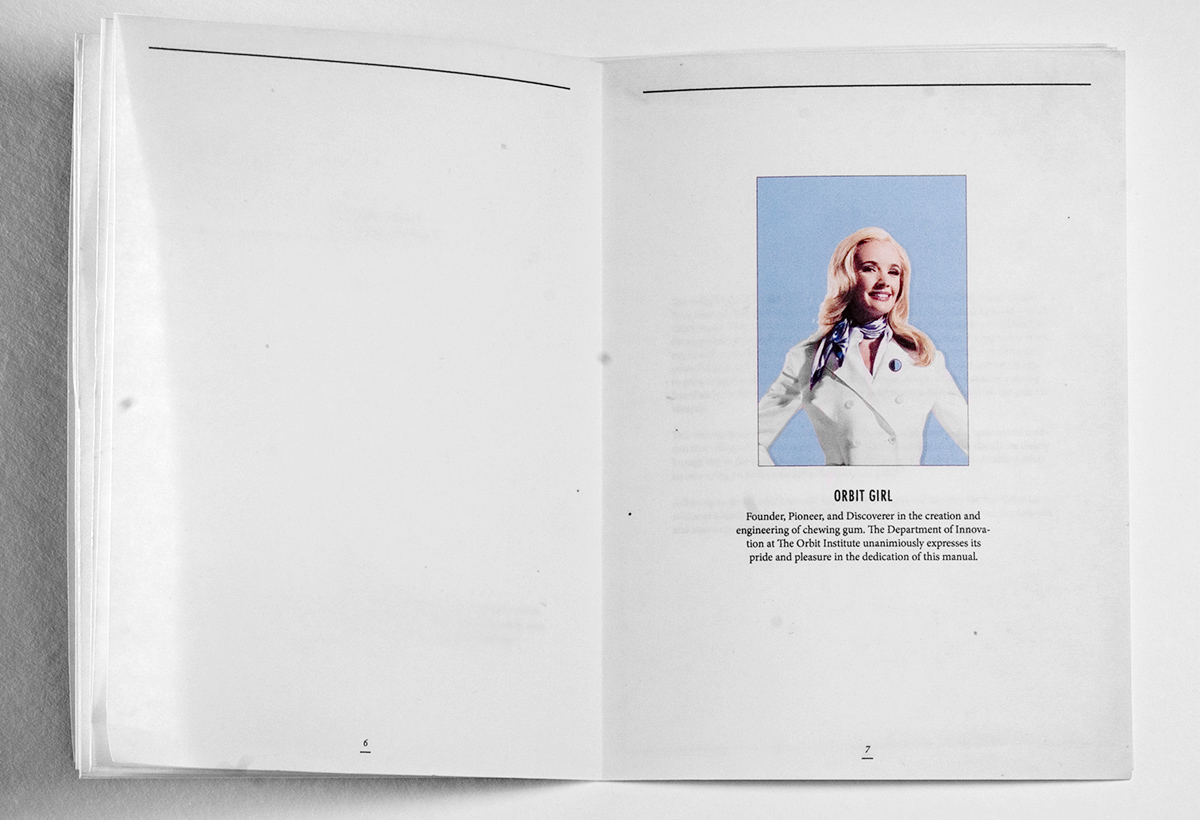
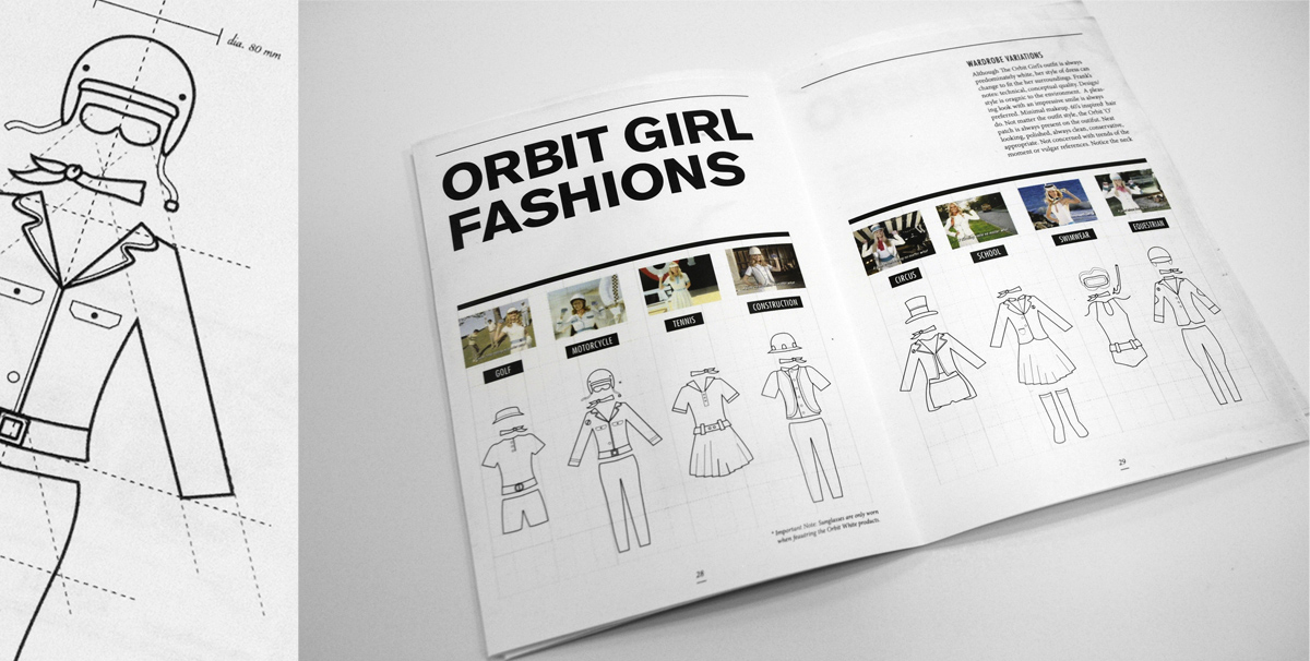
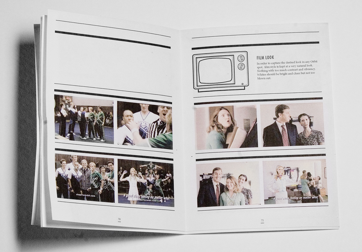
Wrigley's Orbit gum needed a styleguide to house all their brand elements and existing equities. Leveraging the quirky, retro nature of the brand itself, the copy tone was professional, witty, and matter-of-fact. The visual look was inspired by old 1960's car and engineering manuals, full of technical drawings and step by step procedures. The handbook was produced with minimal treatment: newsprint paper, simple saddle-stitch binding, and treated to look like it was 'weathered' - as if it was found in a dusty office cabinet at the Orbit Institute. Responsible for the concept, overall look, design, as well as the technical drawings.